Miss V: The Kitchen
The Kitchen. Our biggest home improvement project to date- by far. I have always dreamed of creating a kitchen from scratch (as clearly evidenced by my plus-sized Pinterest kitchen board), and I feel so fortunate that I am able to put these dreams to work. Not since high school have I lived in more than 750 square feet. I’ve grown rather accustomed to my tiny galley kitchens, so this is a big leap.
Disclaimer: What follows is a fairly long and detailed post about all things kitchen-y. If you are not so much kitchen/reno-inclined, do as the Jedi Mind-Tricked Stormtroopers say and, “Move Along”. You seriously may want to skip this one and check back in later this week for some tasting notes.
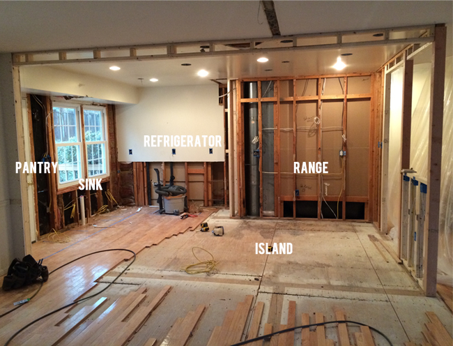
Here she is kids, our kitchen as is right now at this very moment:
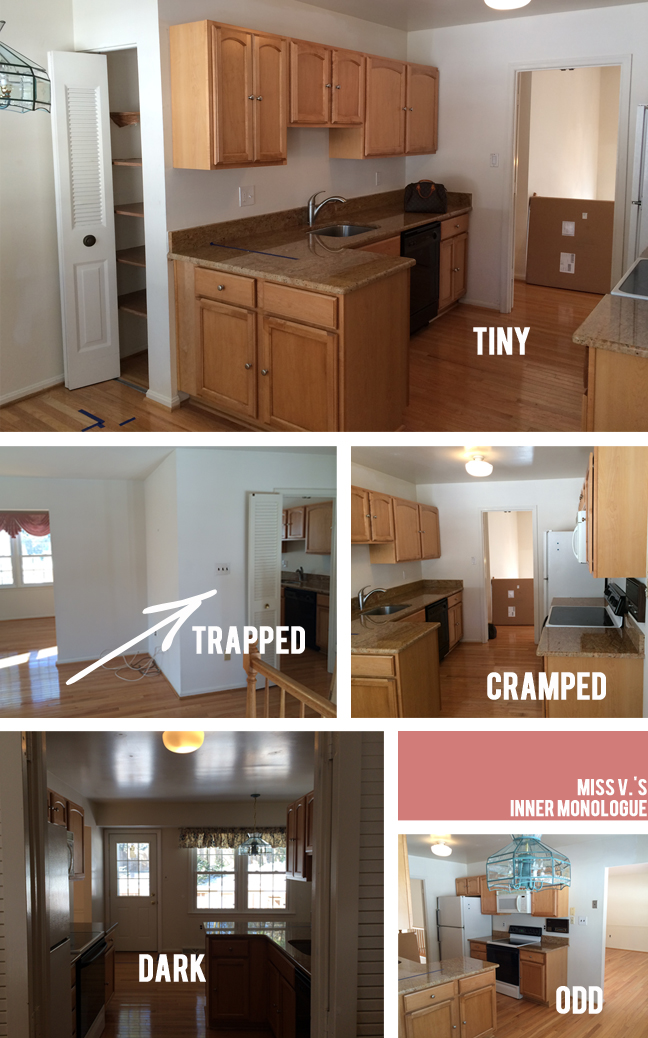
And below, how Miss V. looked when we found her.
If these walls could talk, I think this is what she would say, “I feel…”:
A tight galley kitchen with dated cabinetry, hardware, fixtures and appliances, she was in dire need of a major makeover. Once we got rid of that wall separating the kitchen from our main living space, things perked up a whole lot. And as soon as we stain these sad and yellowed floors a rich dark tone, things will get a lot crisper and cleaner too.
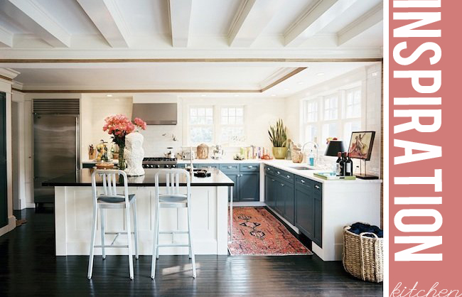
My Inspiration Kitchen:
I realize a lot that I love about this kitchen has to do with great styling- I mean there IS a giant white owl on the countertop admidst a painterly canvas on a stand, a table lamp, and a Buddha head, not exactly found objects in one’s normal kitchen – this photo screams “Great Prop Stylist!”. This kitchen’s also decked out with terrific ceilings and an over-abundance of light and windows, two things that did not come with Miss V. Though I may not have a nocturnal bird statue perched on my island (although- why not?), I still aim to recreate this kitchen’s spirit in my own way.
I love the clean white lines and the pop of dark cabinetry. I was going to do two-toned cabinets with my uppers being a mix of white cabinets and open shelving and my lowers being navy but the pantry threw me off. I didn’t want a tall looming dark pantry, so I decided to make the cabinets on the island dark and the rest white. We are going with a dark ebony wood stain on the island cabinetry as opposed to navy since we ended up loving a navy sofa. You can have too much of a good thing. We are losing a window as we are making the original door to the deck our new pantry and that door had a big window in it, which is a big Boo. I think the lighter we go, the better off we’ll be but I like the idea of contrasting the dark island with the rest of the white cabinetry.
I do love that this kitchen does not have any fussy pendant lighting or window treatments. Our space is not huge and I’m putting a big fixture over our dining table so I opted for no pendants and a cleaner look as well. I’m on the fence about a window shade, we’ll see how it all shakes out. I’d love to find a pretty rug to soften the dark/light contrast and add some interest.
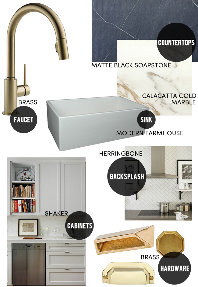
I know that the white kitchen with marble countertops is not exactly a cutting edge design development, but it’s classic and beautiful, tried and true. There’s something really satisfying and clean about all of these elements that will ground our kitchen and make her feel more rooted, I think:
The Faucet
I know everyone’s going crazy over brass right now but I think it’s timeless and I love the mix of metals with stainless appliances, so I’m going for the gold. Brushed brass (believe it or not) has not quite caught on in the affordable kitchen faucet world yet but after much research, I did manage to find this little beauty by Delta. My mom is renovating her kitchen right now too and bought the same one, unbeknownst to either of us. It’s a beaut.
The Countertops:
Call me crazy, but I just have to have me a giant slab of Calacatta Gold marble. I can’t tell you how many people have tried to talk me out of it. I know it’s porous, will stain easily, and is maybe not the smartest call with toddlers but hey- it’s been hanging out all over Italy for thousands of years and still looks great. I’m not one of those people who can’t bear a nick or a stain on their surfaces. I’m pretty much the farthest thing from Type A that you can get. I don’t color in the lines, sometimes not even on my own lips (I was dubbed “The Messy Showgirl” by my fellow Broadway dressing room pals as I never quite seemed to have that perfect showgirl face- always a bit messy) Perfection is not my style. I like a little patina. I’ve had a groovy little 1960s marble end table that I nabbed at the Chelsea Flea Market back in the day, with its own happy little patina that I think looks terrific. So, we’re going with marble for the island. For the rest of the countertops we fell in love a super matte black slab of soapstone. This stuff is so good, you just want to cut a big chunk off and eat it. Again, not the hardest stone around and apparently a bit of maintenance to keep up, but I can’t help it. When you love something, you just want it around.
The Sink
I’ve always wanted a big white fireclay farmhouse sink but I didn’t want the rounded country lines or the rustic look. I found this lovely lady with its clean straight lines and an extremely reasonable price tag and… sold. Made in Italy- of course. Those Italians are all about clean lines.
The Backsplash
I need to stay within budget somehow so I’m sticking with tried and true subway tile. I was thinking I might do honeycombed marble tiles because I wanted a geometric pattern, but I’ve got my marble on the island so I’m good (plus it’s not in the budget). Subway tile is always clean and chic. I’m going to mix it up a bit and do a herringbone pattern behind the range and straight subways around the sink. I’ll use a grey grout to highlight the patterns.
The Cabinets
I was gunning for Ikea with Semi-Handmade facings which I think is a great choice but our contractor persuaded us to go all wood. He’s old school and although I’d like to have spent a little less on our cabinets, my mind is somewhat put at ease by the idea that they should last a long long time. We went Shaker style to preserve the old-meets-new aesthetic without getting too traditional or contemporary. I think Shaker is a great nod to the old while still looking modern.
The Hardware
I’m not sure which hardware pieces I’m leaning towards yet- bins or straight pulls. To knob or not to knob? I sort of blew my budget by ordering about 20 different pulls and knobs- but how else do you know, right? The hardware decision is an ongoing process, but I know they’ll be brushed brass. I’m looking at these, these and these. I’m also looking at these, these, these and these and maybe these. Oy.
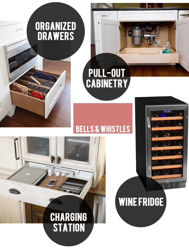
A few bells and whistles that I’ll get with this kitchen:
These bells and whistles may not seem like such a big deal to some of you folks but for me, they kind of mark my entrance into grown-up land. Just because I’m a little messy, doesn’t mean I don’t want to be organized. Not that I ever have been, but my number 1 goal in moving into this grown-up house is to finally become an organized human being. Fat chance? Maybe. But I think some of these little things might help. And the wine fridge- I mean really, any self-respecting wine geek with the space for one really needs one- the more to chill the nectar with, my dear. I’d love a super fancy gigantic one but holy price tag! Let’s hope this little cooler will do the trick. It’s not dual temperature, so my reds will still be stashed in their trusty little “cellar” (read: a rattan storage/end table from Target). Hey, just because I’m a wine expert doesn’t mean I’m fancy.
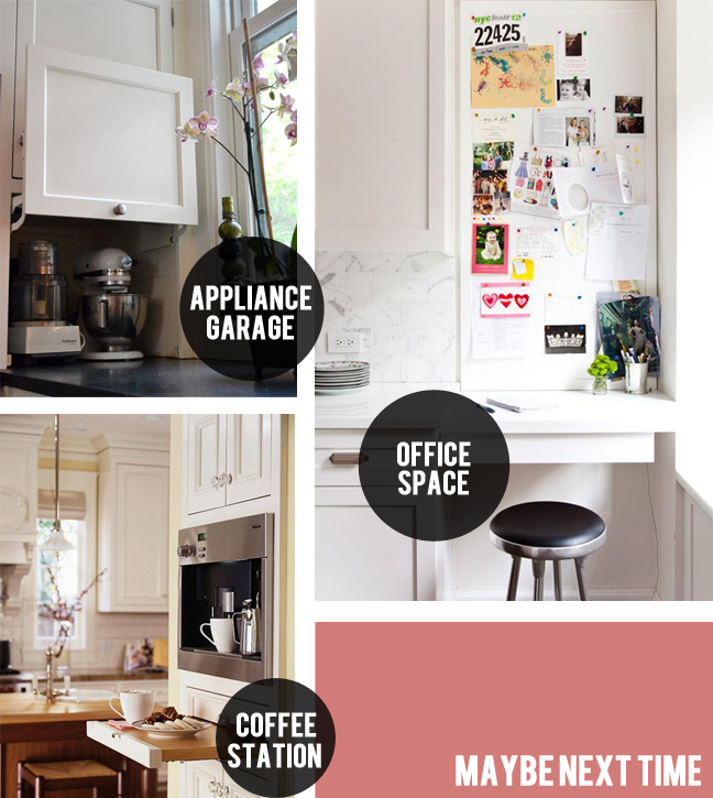
A few things that didn’t make the cut:
Talk about first world problems. Like it’s really a big deal that I didn’t find a way to get an appliance garage, I mean seriously. But, this is a blog after all, not The Economist and we are talking about pseudo-frivilous things like cocktails and kitchens so I thought I’d share some of the things on my wish list that, due to space and mostly budget, didn’t find their way into our design.
Sure, who wouldn’t love one of those fancy appliance garages to hide the blender, the toaster, the coffee machine, etc., but my contractor and my husband both talked me out of this one. They both agreed that they were a waste of money. It’s too fussy for C, but I loved the idea of hiding all that stuff.
The one thing I did really want in my kitchen was a tiny little office nook. I fought hard for this one but, no dice. We just ran out of space. Our kitchen doesn’t have a very big footprint and counter and cabinet space is the priority, so this one did not make the cut. I would love to have had a very organized (there’s that word again) place to stash mail, keys, lists, my laptop etc., but those things will have to find their way down to the mudroom that is doubling as my office.
And a luxe built-in coffee station? Yeah- we didn’t exactly have the additional 3G’s to make this one happen. So much for pressing a button in your wall to produce that perfectly foamed latte. But hey, good things require a little work right? I’ll do just fine with my space-eating on-sale espresso machine. I’m eyeing this one.
On a styling note, I just picked up this oversized vase at Crate and Barrel for $39 because it reminded me of that giant owl. Not that it’s a bird or even an animal shape, but it’s large (14″ tall, a nice substantial size) and white and was the right price.
So that’s the roundup of our soon-to-be kitchen. If you have any tips concerning anything kitchen reno-related, please do share- except of course if they involve reasons why I shouldn’t do marble. You can keep those thoughts to yourself. 🙂
Inspiration Kitchen Image: Patrick Cline/Lonny









I love Miss V’s Inner Monologue. 🙂
Ha ha. Hopefully she’ll have a different one when she’s finished. 🙂
I love it all! You are so so talented and creative! I can’t wait to see it.
This looks AMAZING!!! Love your inspiration kitchen with all the white and black – and great light! I dream of having a spacious kitchen…living vicariously through you 🙂 Enjoy!
Thanks Anna! I can’t wait to have you over!
Wow! Down to the studs; such a scary but exciting time. Love the inspiration images. We did shaker cabinets & aluminum navy chairs also.! You’ve always had the knack and vision for renovation